Urban Prints (2010)
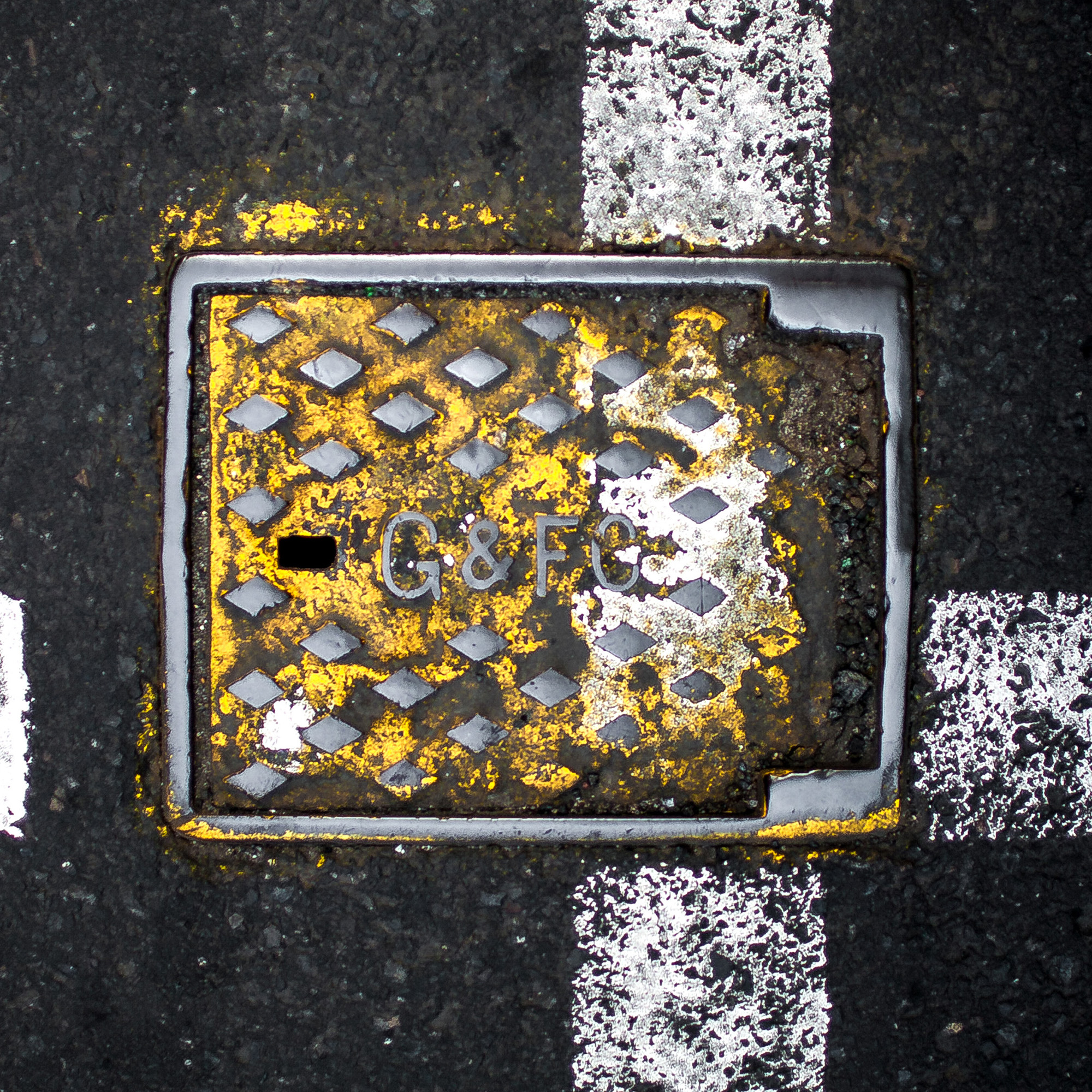
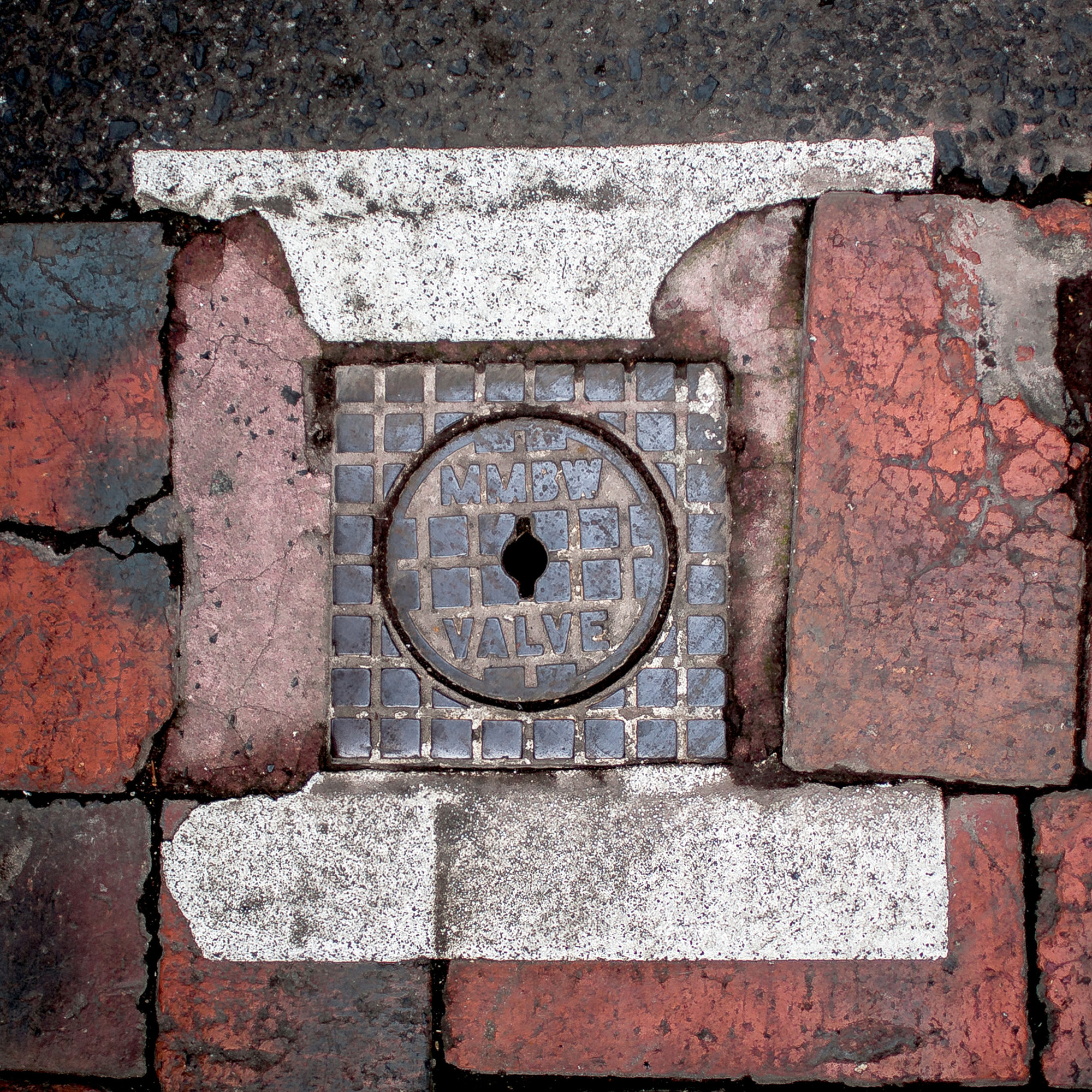
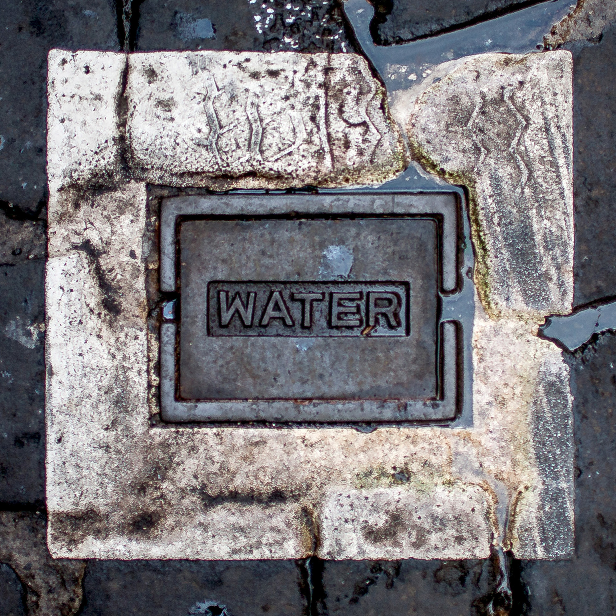
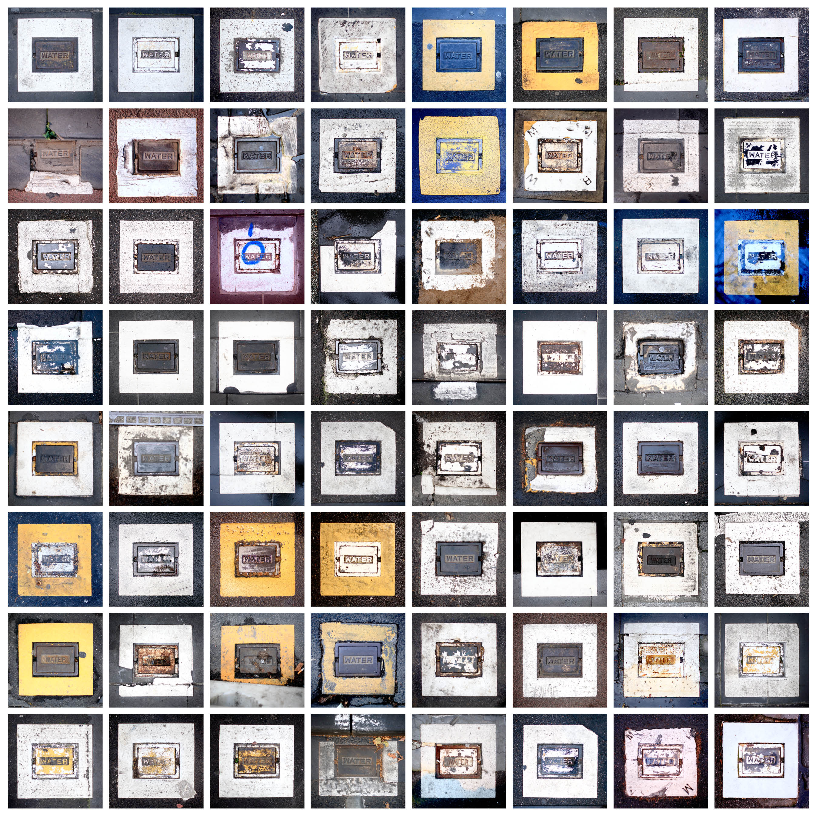
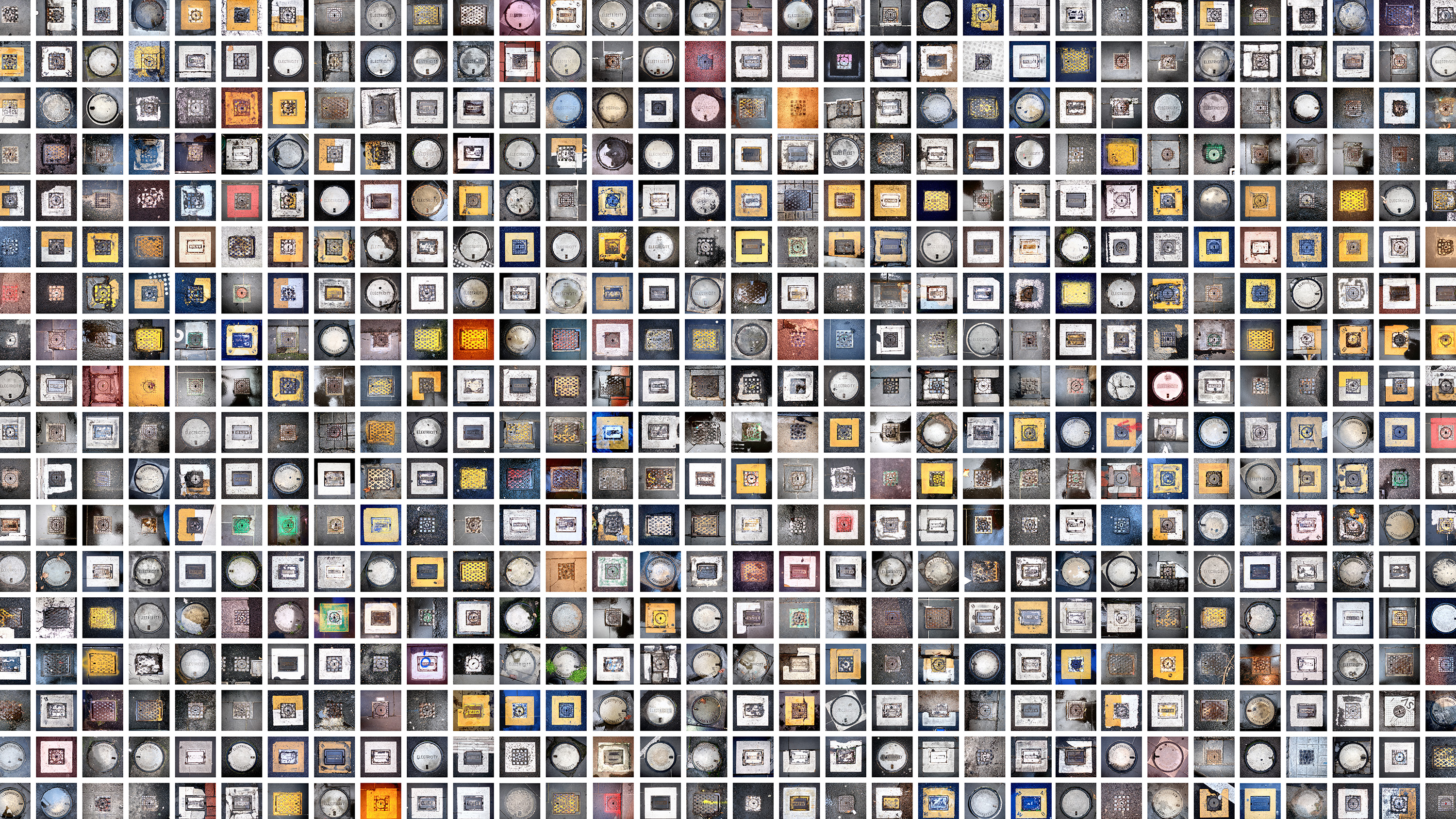
In an increasingly digital world, visual identities tend to disappear unless they are deliberately preserved. Even printed matter is not immune to this disappearance. Yet some forms of identity remain embedded within the physical fabric of the city—quietly persistent and often overlooked. Utility covers are one such example. Scattered across Melbourne’s streets, they carry the names of entities that no longer exist, such as MMBW (Melbourne and Metropolitan Board of Works), later rebranded as Melbourne Water in 1992. Decades on, these markings continue to surface across the city, resisting erasure.
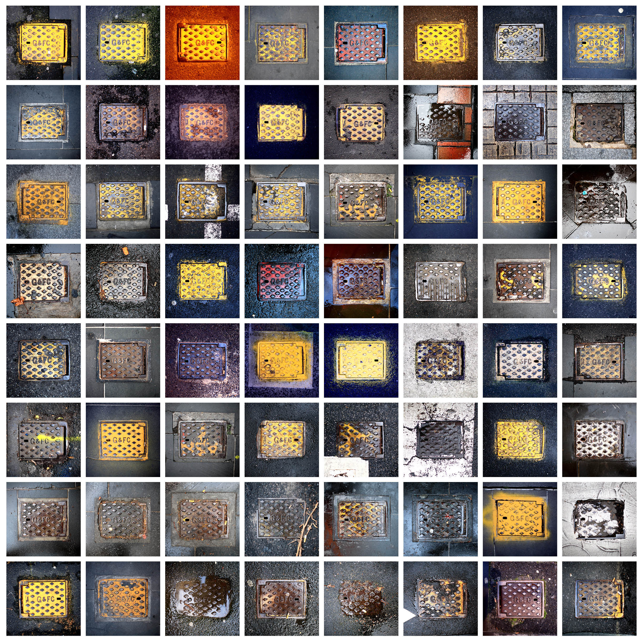
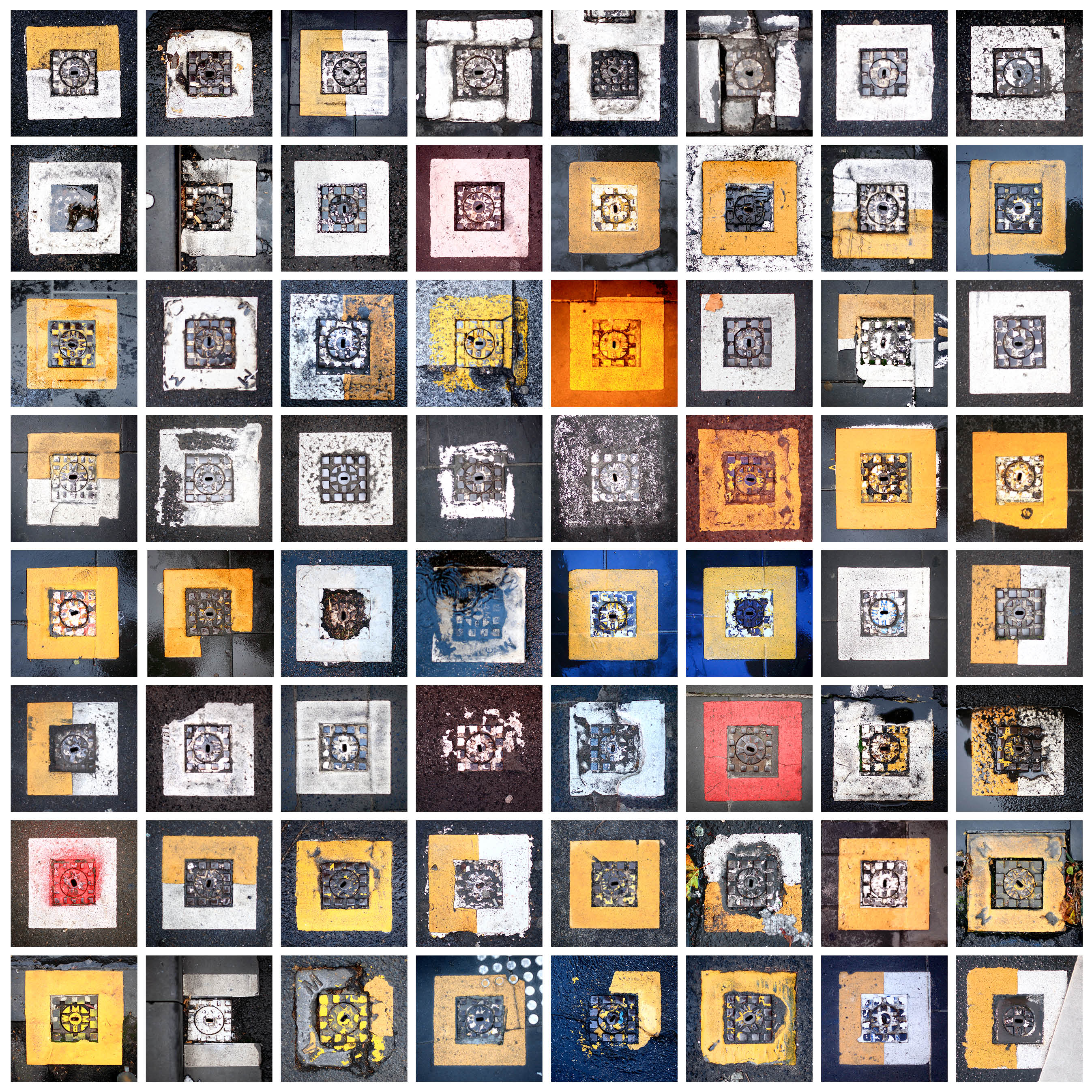
What began as a simple visual observation gradually unfolded into a process of inquiry. Repetition revealed variation; variation invited attention. The act of photographing these covers consistently and methodically became less about documentation and more about recognising patterns across time, material, and use. In tracing the meaning behind G&FC, another layer of the city emerged: the Gas and Fuel Corporation of Victoria, and with it, the story of the now-demolished Princes Gate Towers, where the corporation was headquartered. Through these fragments, the city revealed a history not through monuments, but through its smallest, most functional elements.
This body of work marked a shift in approach and an early attempt to understand the city through accumulation rather than singular moments. Each cover operates as both object and imprint, carrying traces of infrastructure, governance, and time. Together, they form a dispersed archive, one that sits underfoot, quietly recording what once was, and what continues to persist. As information increasingly migrates into intangible forms, these physical remnants gain new significance. Metal, stone, and paint become carriers of memory and unintentional markers of identity that outlive the systems that produced them. In this sense, the city becomes readable not only through its skyline or landmarks, but through its overlooked surfaces, offering a foundation for a way of seeing that continues to inform the work that followed.