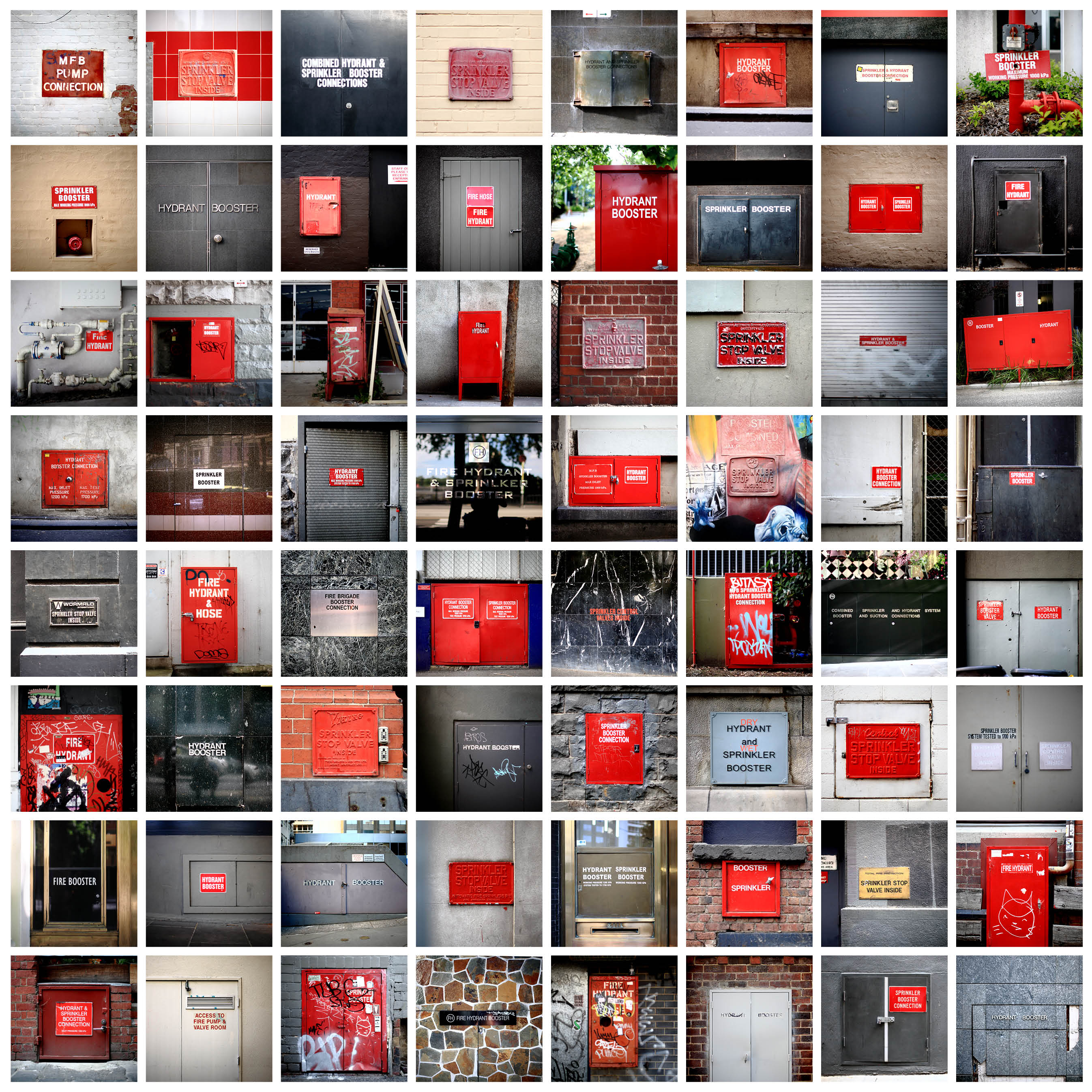
Hydrants: Melbourne (2012)
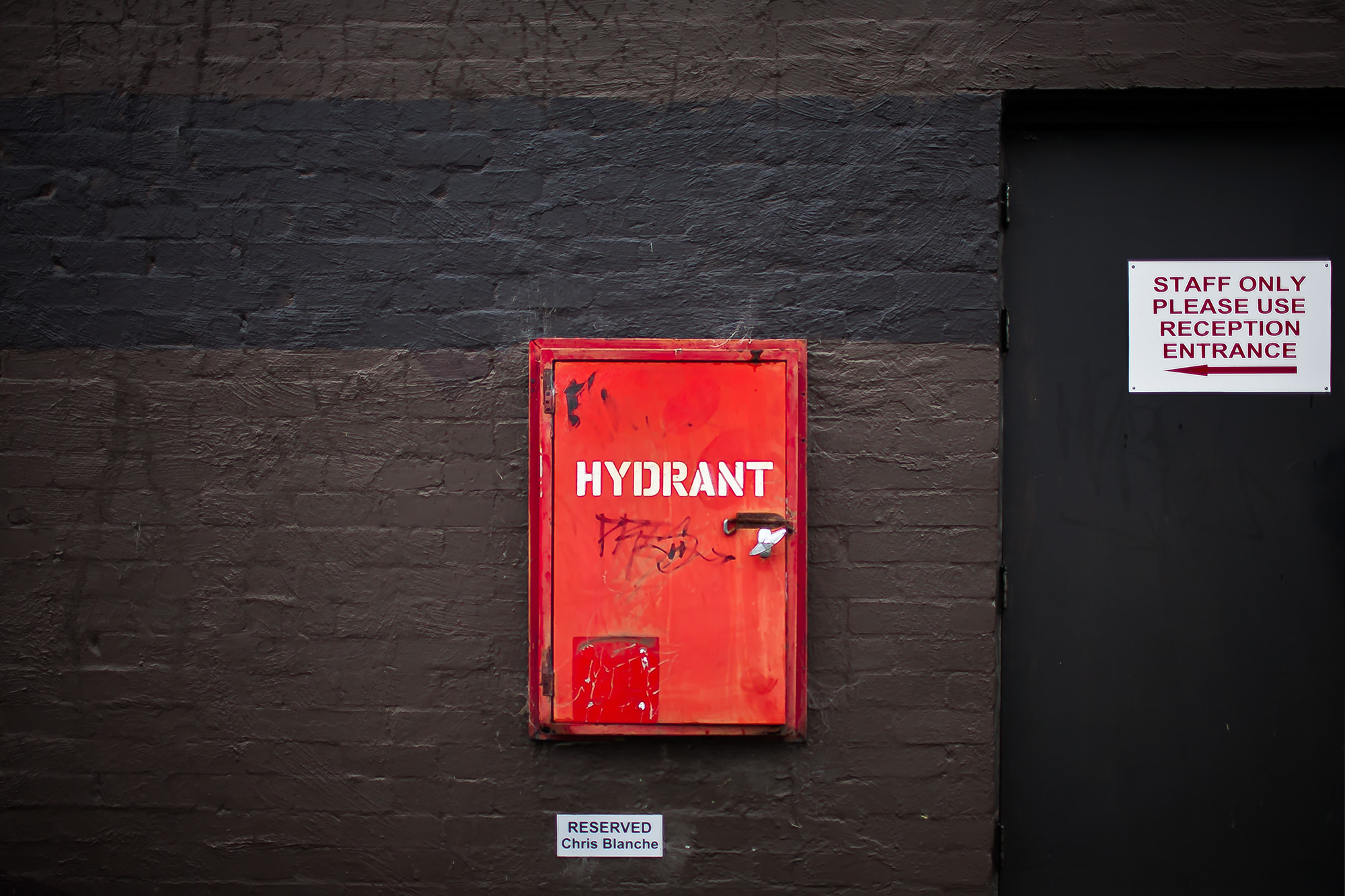
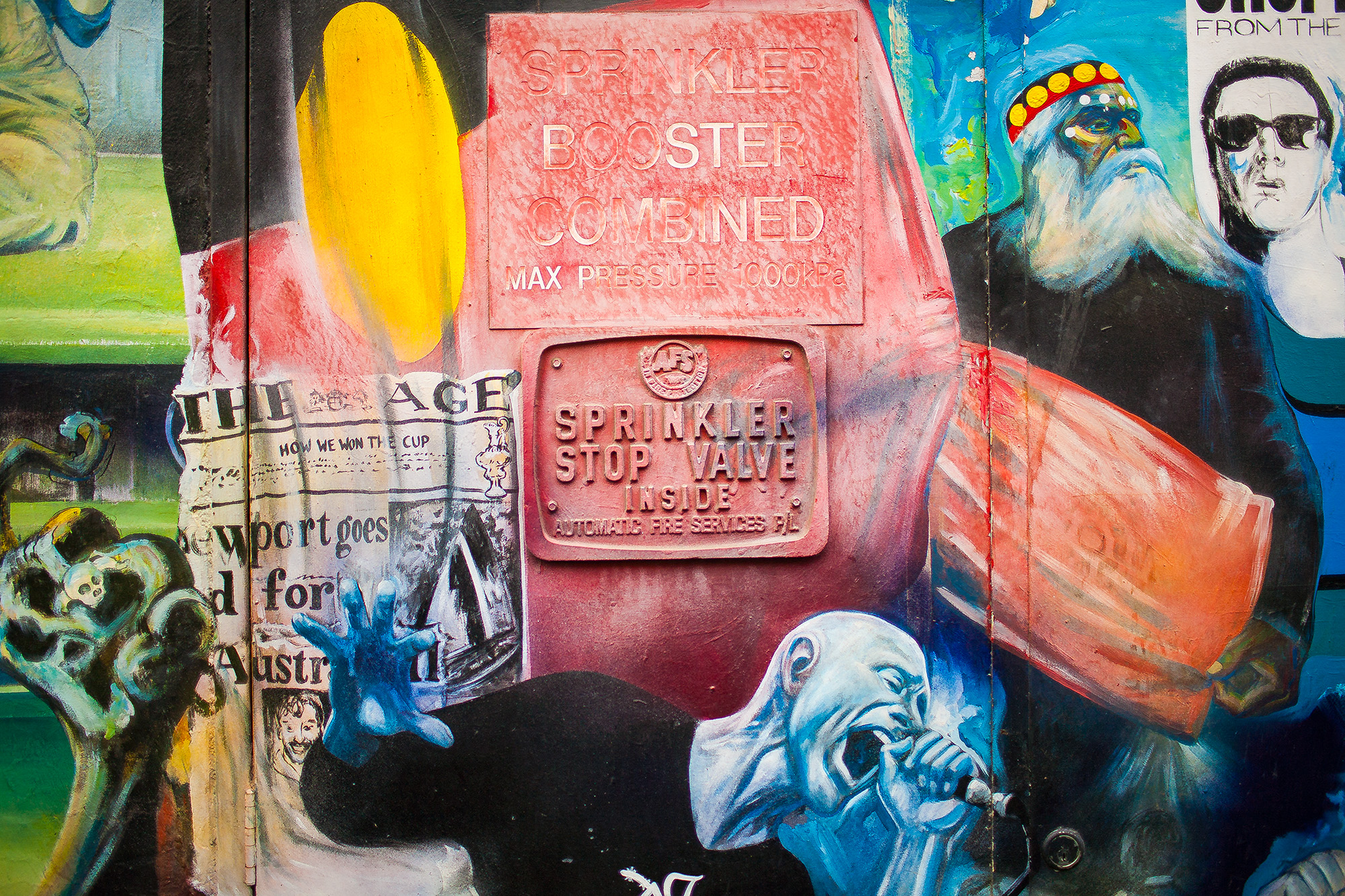
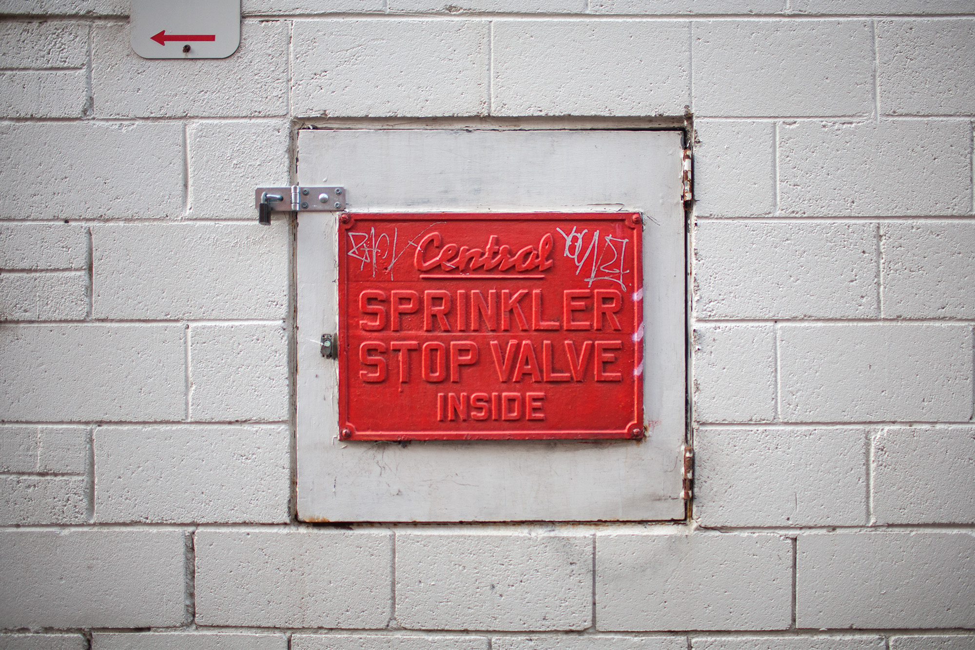
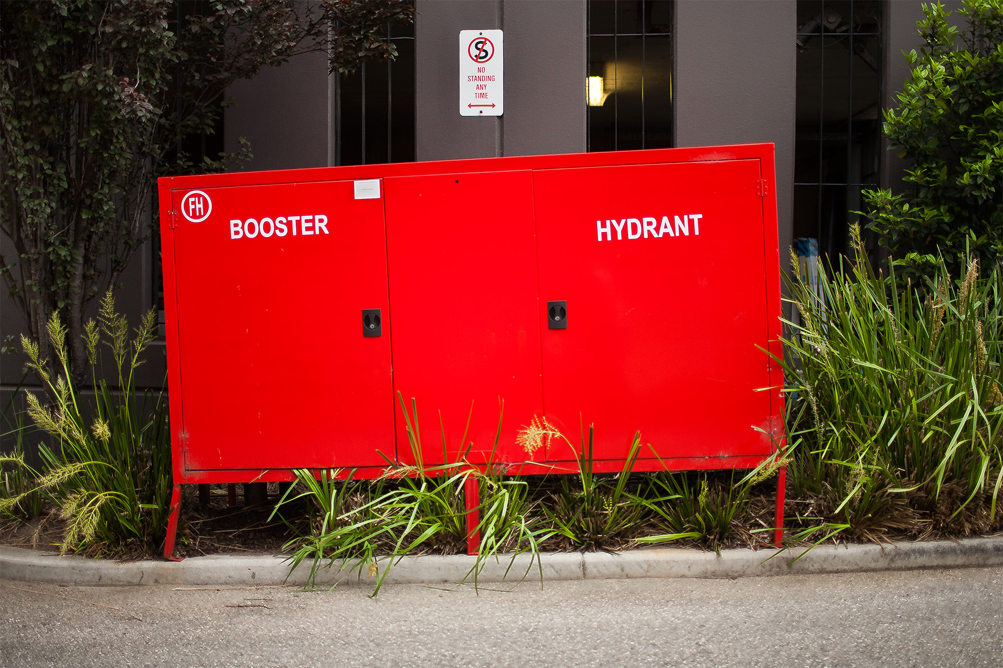
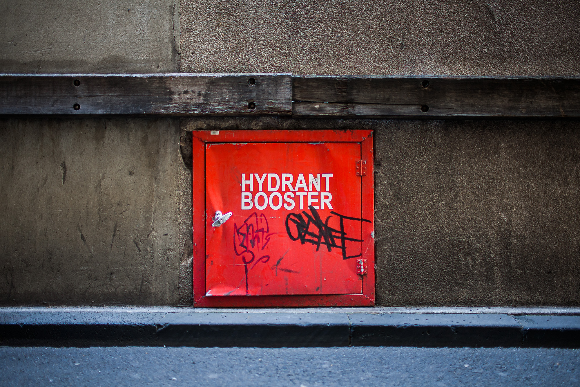
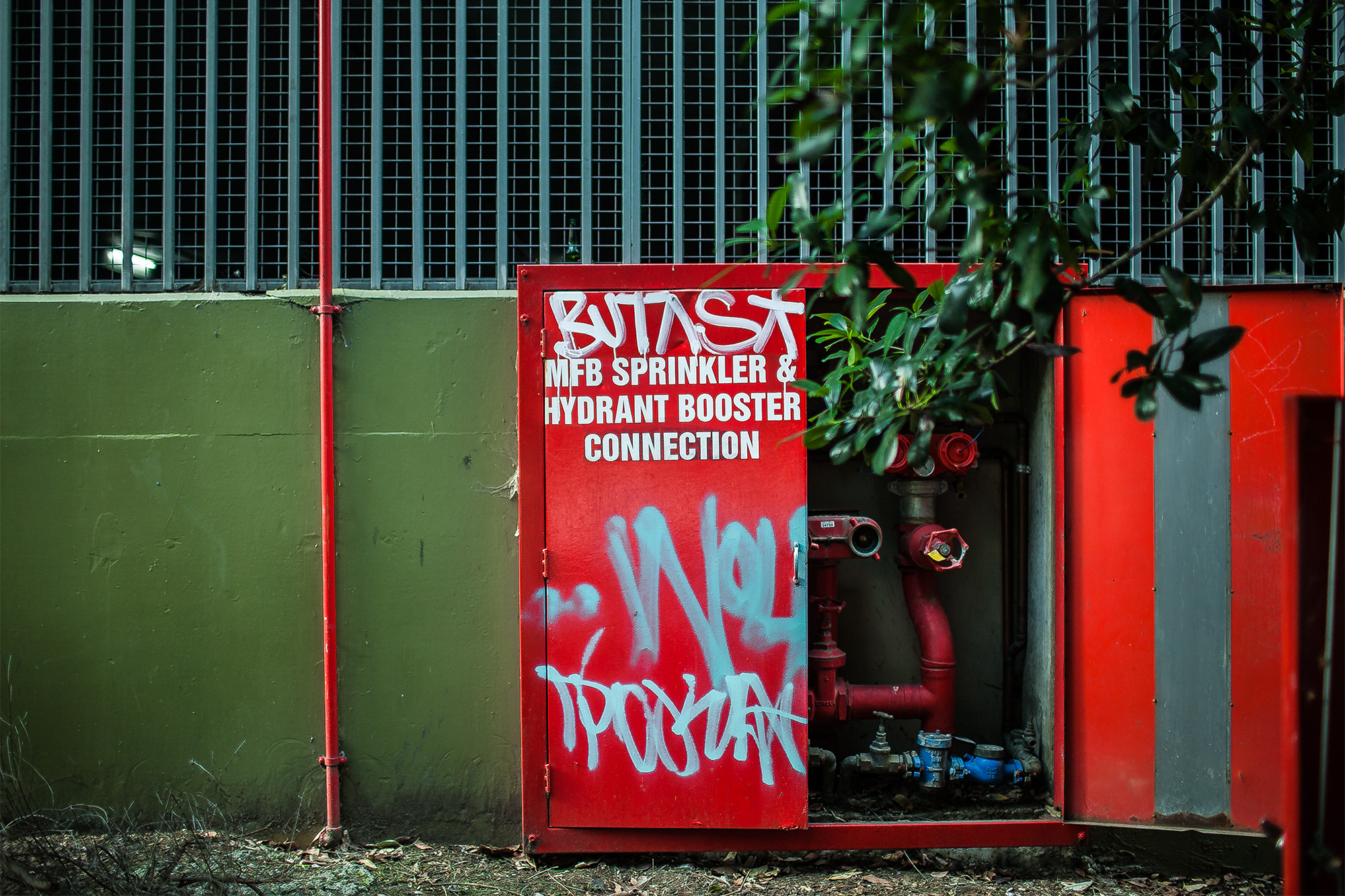
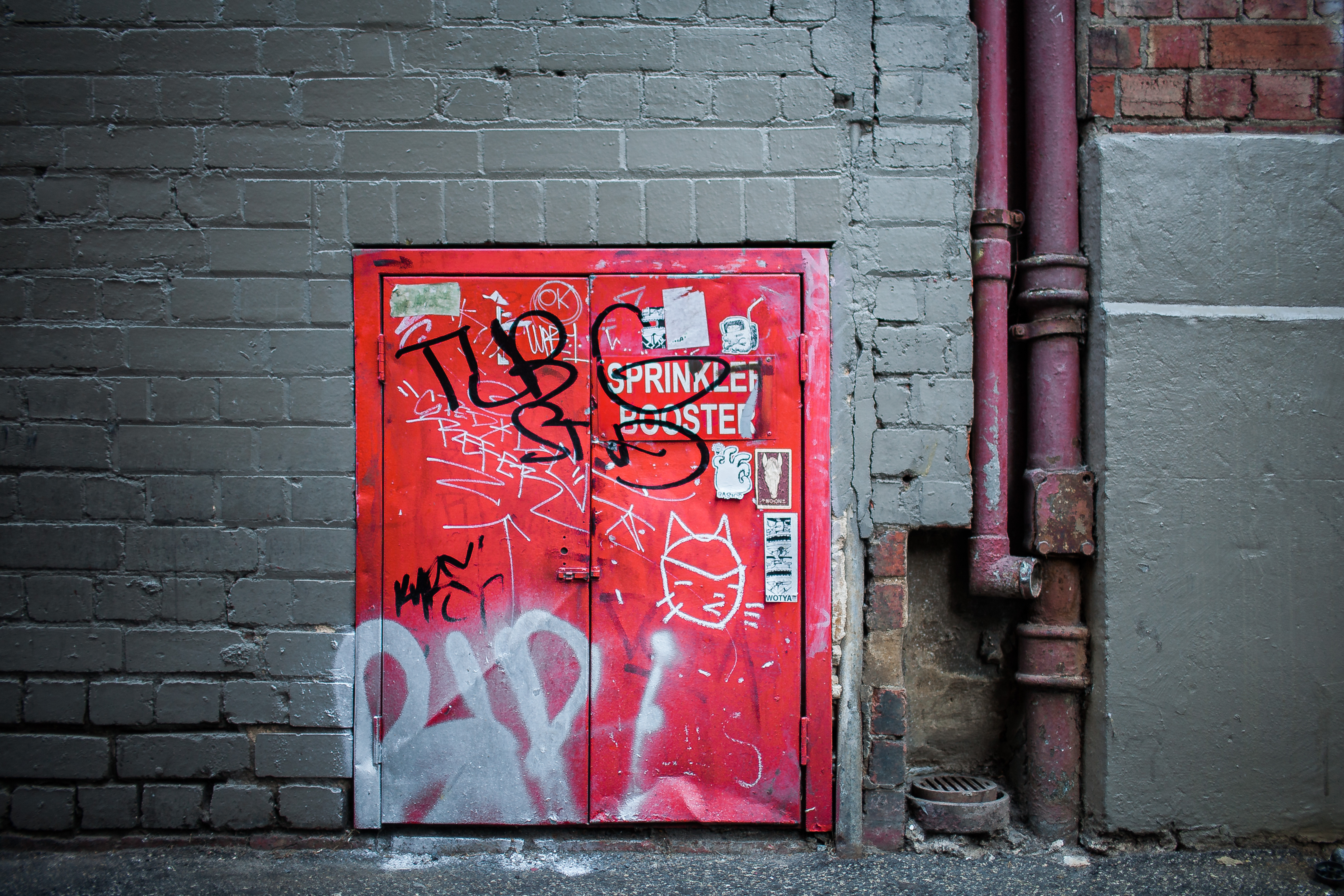
Unlike the UK, hydrant signs in Australia aren’t standardized, therefore each sign has a distinctive appearance. However, when compared to No Parking signs, they aren’t as individualistic, as they’re formally designed to serve a utilitarian purpose. Most are red, in line with signs of the same category in other parts of the world. Playing close attention to typography, many do not fit comfortably in the built environment for using typefaces such as Arial, which is more suited for word-processing and screen – not signage. This typeface, which features a distinctive – and rather odd – capital “R”, happens to be repeated in words such as “HYDRANT”, “BOOSTER” and “SPRINKLER”, sending all sorts of alarm signals to its adversaries. These signs reach their lowest point when sign-makers shamelessly distorted the letters to make the overall message fit.
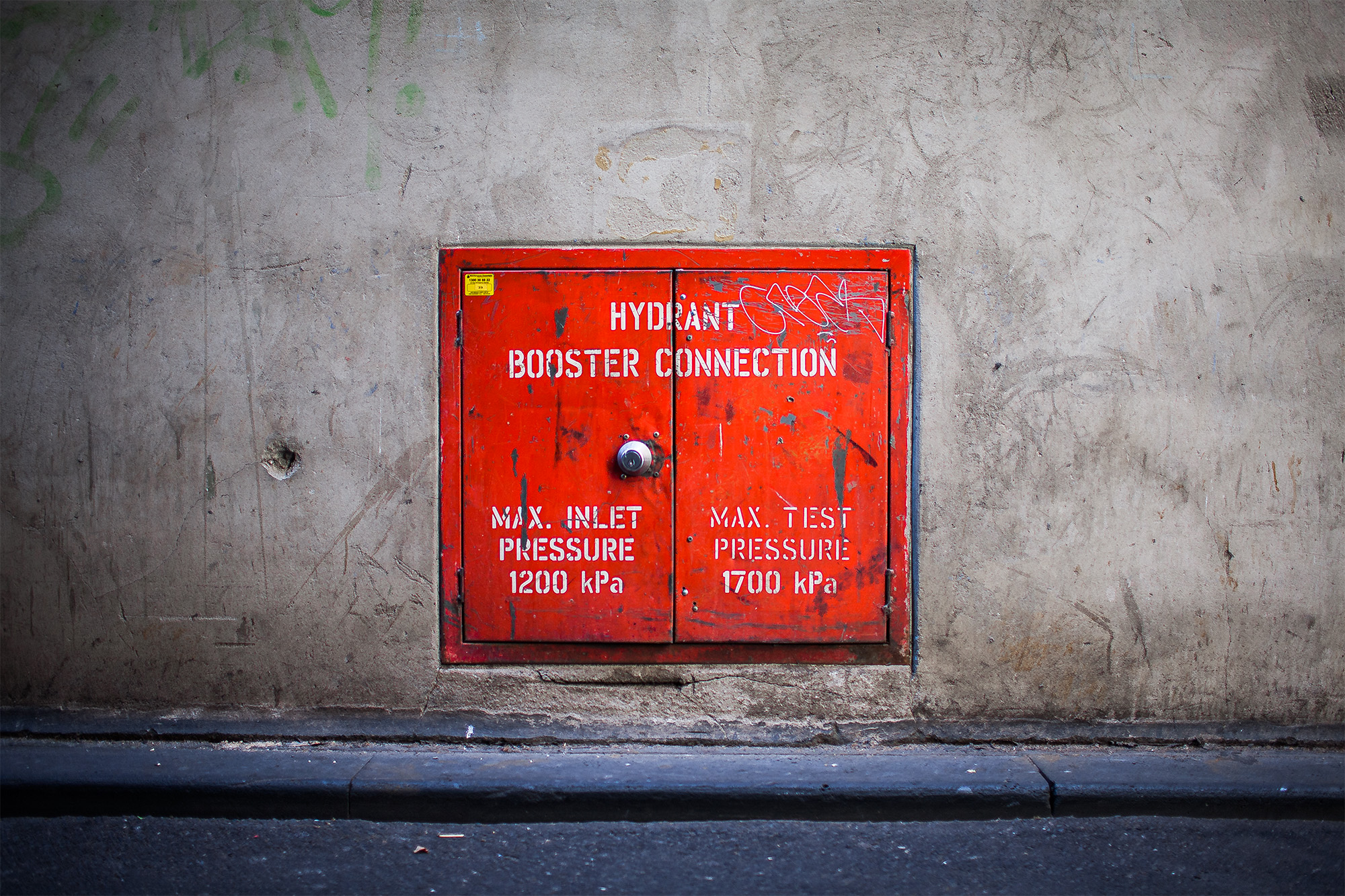
On the bright side, many are attentively designed to sit well within their physical constraints, with some featuring stencil styling that honours the context at functional and aesthetic levels. The gold medal, however, goes to older signs that acquire qualities found in plagues. Made from steel, it allows them to belong to the same family as these utility covers. Beyond their communicative value in emergencies, these well-crafted signs add a micro-architectural value to any wall and its building.
